Solt & Co.
Home Services Work Journal About Contact
Strategy●Content●Copy●Strategy●Content●Copy●
&
Work

Marketing, strategy, content.

The first two case studies below are real projects. Samples 03 to 05 are written to show how we work.

Case 01 · Campaign Case 02 · Meta Ads Sample 03 · Landing page Sample 04 · Email sequence Sample 05 · Product copy

Good marketing doesn't start with creation. It starts with analysis: where does the brand stand, who are its customers, and what's actually stopping them from deciding?

Only once we have those answers does a strategy take shape, and from that, content with structure, a voice and a function. Whether we're building a full campaign or writing a single product description, the foundation stays the same: understand the market, find a clear position, write content that sells.

Case 01: Marketing campaign
Industry Fitness & wellness Scope Campaign, 3 documents, 30-day plan Problem Their strongest offer wasn't showing up in the marketing

OK GYM Pardubice: a full marketing campaign

The situation

OK GYM Pardubice Dubina is the only fitness centre in the city combining a gym, three types of sauna, a climbing wall, bungee workouts and massage, at a price comparable to competitors offering a quarter of that. The centre was opening a new lower floor, but none of this range showed up in its communication: customers still saw it as a standard gym.

What wasn't working

  • Communication focused only on the gym. Sauna, climbing and bungee were never mentioned at all.
  • No competitor analysis. The centre didn't know where its real edge was.
  • Posts were random, with no content strategy or consistent tone

The approach

We started by analysing five main competitors in Pardubice. None of them offered gym, sauna, climbing and massage under one roof, yet OK GYM's own communication never mentioned that gap. From there, we built three communication pillars, a positioning statement, and two 30-day content plans with ready-to-post captions, plus a marketing guide split for the owner and for whoever runs the social accounts.

Positioning statement

For people in Pardubice who want more than just a gym, OK GYM Pardubice Dubina is the region's only complete sport and wellness centre, combining serious training, adventurous activities and real relaxation, at a fair price, in a place where you're known by name.

Ready-to-post caption: Instagram + Facebook carousel, day 12

Think climbing is only for experienced athletes? Think again.

Our new climbing wall has auto-belays, so you can climb entirely on your own, no partner, no experience, your own pace. A bouldering wall with a foam pit? For the ones who want more. A Moonboard with an app? For the ones who want to compete.

Climbing, for everyone. Coming soon to OK Gym.

Case 02: Meta Ads campaign
Industry Fitness & wellness Scope Meta Ads campaign, 3 ad sets, 11 ads, 14 days Problem A new floor full of offers that people in town didn't know yet

OK GYM Pardubice: a two-week Meta Ads campaign

+39%
Customer base growth in just two weeks
1,328
Landing page views from the ads
€103
Spent, of about €205 planned

The ads ran alongside the gym's regular social media, which we manage too, so not all of the growth can be credited to the ads alone.

The situation

OK GYM Pardubice Dubina is a Czech fitness centre we work with long-term. Its new lower floor had just opened, with three types of sauna, a climbing wall, a bouldering wall, a MoonBoard, massages and group classes. The offer was strong, but many people in Pardubice didn't know about it yet. The goal: bring in as many new visitors as possible on a Meta Ads budget of about €205.

What we were up against

  • A small local market, limited to the Pardubice Region
  • Many different offers to explain, each for a different kind of visitor
  • A small budget for the whole campaign

The approach

We built one campaign with three ad sets, split by what a visitor is looking for: Relax, Fitness and Climbing walls. Every activity got its own ad, 11 in total, so each had a message of its own. All ads share one layout: a photo, a two-line headline, three short steps and one call to action, so they look like a family. The copy is in formal Czech, in line with the gym's voice. We kept the audience broad, the Pardubice Region and ages 18 and up, and let the creative do the targeting. The campaign ran for 14 days and ended on 24 October 2026.

What we learned

Climbing was the cheapest offer to promote, Relax the most expensive. Interest peaked in the first days and then drifted down, so next time we would swap the creatives after about a week.
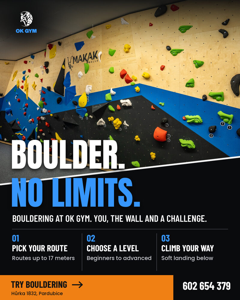
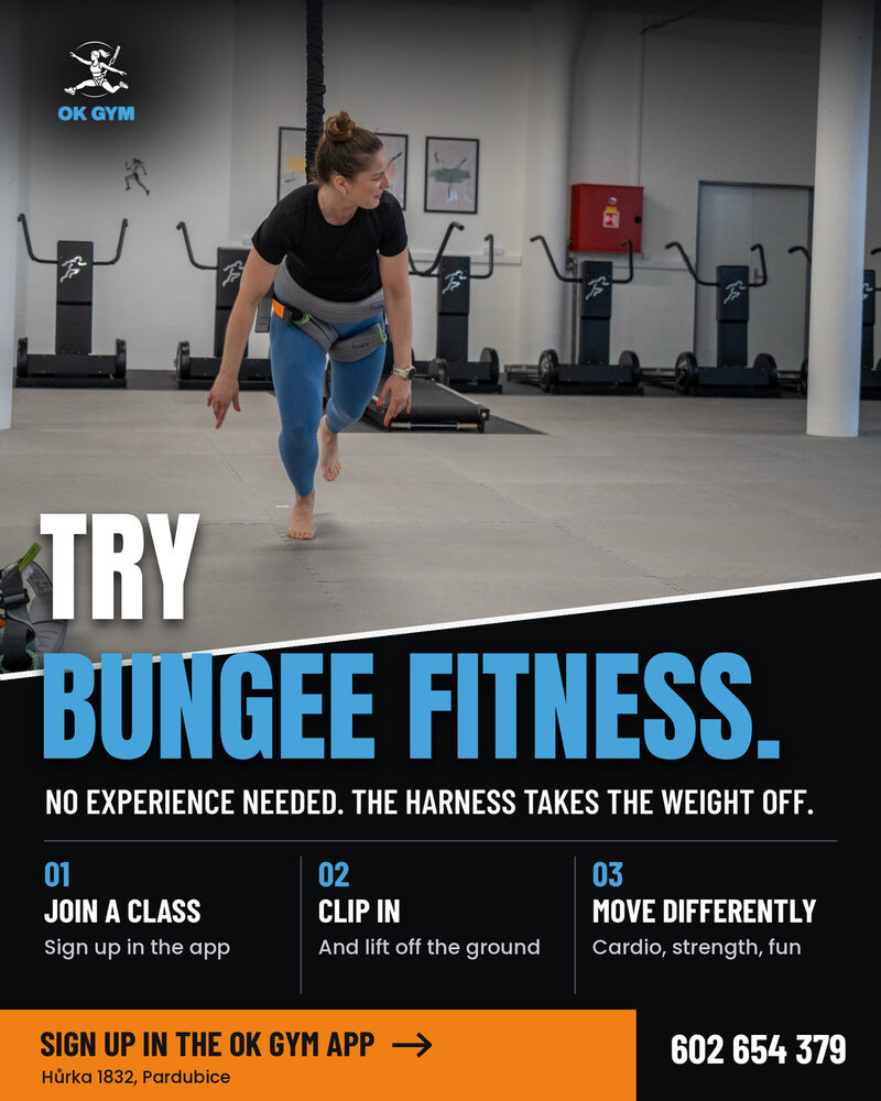
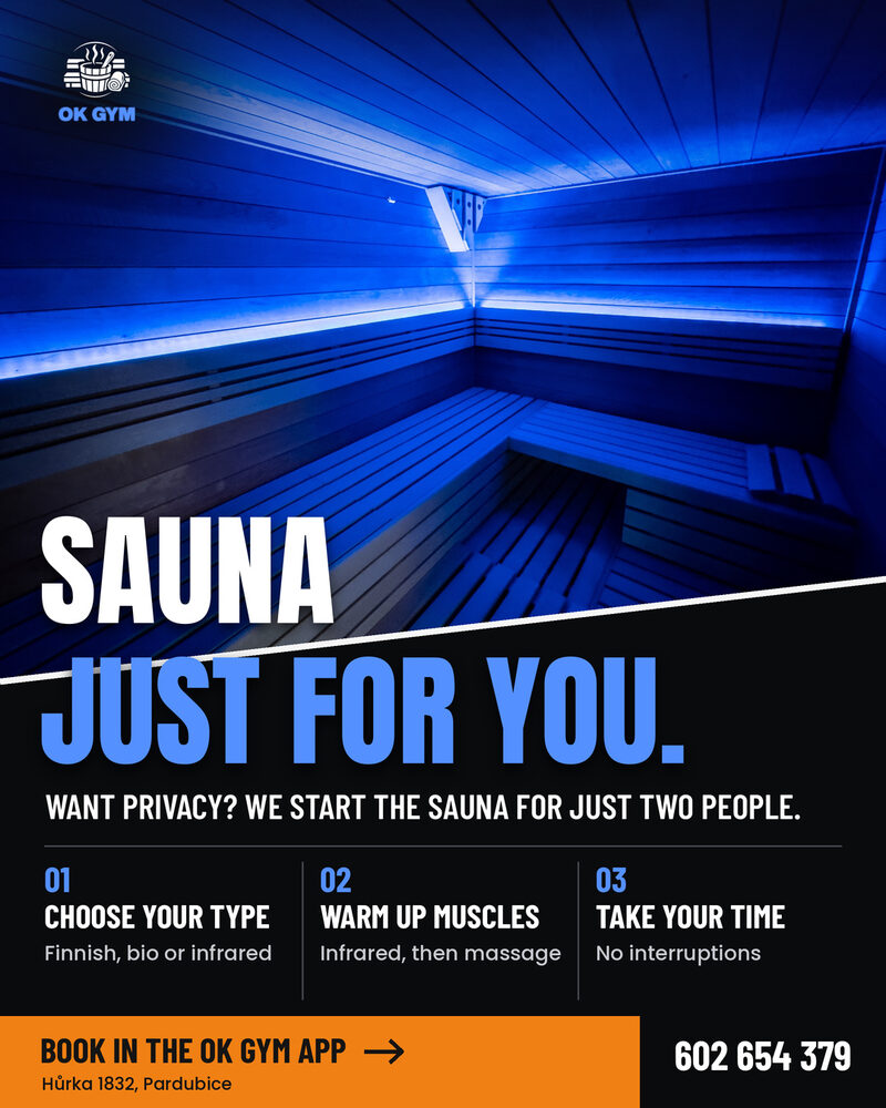
The ads: one per activity (the originals ran in Czech)
OK GYM Meta ad for bouldering: Boulder. No limits. Bouldering at OK GYM. You, the wall and a challenge.
Climbing walls ad set
OK GYM Meta ad for Bungee Fitness: Try Bungee Fitness. No experience needed. The harness takes the weight off.
Fitness ad set
OK GYM Meta ad for the sauna: Sauna. Just for you. Want privacy? We start the sauna for just two people.
Relax ad set
Client feedback

"They know exactly what they're doing. They have a clear overview, know where to target advertising, bring great ideas, and above all take our company's promotion as their own, as if it were their own business. Precision and quality work are their motto. I recommend them, they've grown our visitor numbers."

Martina, owner, OK GYM Pardubice

Read the full story in the Journal →

Sample 03: Landing page
Industry Online education Scope Landing page, ~1,200 words Problem Conversion under 1%

An online course for beginner graphic designers

The situation

The client offered an eight-week graphic design course. The content was solid and the instructors experienced, but the page wasn't convincing anyone. It talked about hours and modules instead of what a student would actually walk away with, and most visitors were people who had been thinking about it for a year. The page needed to say one thing: you can do this.

What wasn't working

  • The hook talked about the course, not the customer
  • No clear answer to "who is this for"
  • Objections were never addressed

The new architecture

  • Hook, naming the frustration directly
  • Problem, stated specifically
  • Solution, positioned as the answer
  • What you get, framed as outcomes, not modules
  • Who it's for, and who it isn't
  • Four objections, answered directly
Original hook

Learn the fundamentals of graphic design in 8 weeks.

New hook

You've been putting off your first client project for a year, telling yourself you're not good enough yet. After this course, you'll have a five-project portfolio, and you'll know exactly how to sell it.

Objection handling, example

"I don't have the talent for this." Talent for design isn't something you're born with. It's a set of skills you can learn, and we teach it step by step, with no assumption that you've ever drawn before.

"I'm too old." Our youngest student was 19, our oldest 54. Both are taking on paid work now.

Sample 04: Email sequence
Industry Natural cosmetics Scope 5 emails, welcome flow over 10 days Problem Customers disappeared after their discount code

A welcome sequence for a natural cosmetics e-shop

The situation

The client sent a single email: a welcome message with a discount code. Customers used the code, bought once, and disappeared. There was no relationship built before the second purchase. The goal was trust, not another sale, shown early enough that the second purchase would follow naturally.

The philosophy

Every email has to give the customer something, even if they don't buy: information, a perspective, a useful tip. The sale follows naturally once the customer believes the brand understands them.

Sequence structure

  • Email 1 (immediate): a welcome message with the brand story and the code
  • Email 2 (day 2): how to read an ingredient list
  • Email 3 (day 4): the most common mistake when choosing skincare
  • Email 4 (day 7): recommendations by skin type
  • Email 5 (day 10): a question, and a soft nudge to buy
Email 2, in full

Subject: Ever actually read the ingredient list on your moisturiser? Here's how.

Most of us flip the jar, read "aqua, glycerin, parfum," and put it back. But that list is exactly where the answer lives, why one cream works for you and another doesn't. Today we'll show you three things worth checking before you buy.

Sample 05: Product descriptions
Industry Designer glass Scope 8 descriptions, 80 to 120 words Problem Descriptions described the product. They didn't sell it.

Product descriptions for a hand-blown glass e-shop

The situation

The client sold unique hand-blown glass from Czech glassmakers. The products were beautiful and the story behind them strong, but the descriptions read like a catalogue: dimensions, colour, material. No context, no emotion, no reason to buy.

Our approach

We treated every product as an object with a history, asking who made it, how long it took, and what makes this particular piece unusual. Each new description carries three layers: the story of how it was made, a description, and a reason to buy.

Original

Smaragd vase. Hand-blown, 22 cm tall, 10 cm diameter. Green. In stock.

New

Smaragd was born from four hours at the furnace and one decision: let the glass find its own shape. Which means every piece is a little different. About 22 cm tall, in a green that shifts with the light, cool in the morning, almost gold by afternoon. On a table, a windowsill, or as a gift no one else will receive.

Want a result like this for your brand?

Tell us what you're working on. The first consultation is always free.

Book a free consultation